

New Paths from May to October for the S&P500

As shown on the weekly S&P500 chart since November 2016, we have drawn a Widening Triangle joining, on one hand, the parabolic rising top of January 2018 and the top of September 2018; and, on the other hand, the low of February 2018 and the panic selling low of 24 December 2018. Triangles often represent a pause within this bull phase, which started in 2009, before its final top is expected above 3025, sometime in 2020. A “classic” Widening Triangle calls for its final branch to end below the December 2018 low before turning up toward the 2020 high. While it is the path supported by a very experienced Elliott Wave proponent, we beg to differ and propose for our less perverse Widening Triangle’s two Paths, which may better take into account the current, rather more neutral, position of institutional investors.
First, the Green Path envisions the current rise to meet the upper trendline in late July near the 3025 area, thanks to a continuation of the outperformance of growth stocks over value stocks. In the short term, it may modestly correct toward 2875 in May and then resume the uptrend at a less steep angle into a rising wedge. Following 3025, that 62% retracement of the whole rise from 1810 toward 2606 should come by mid-October. Then expect a final rise into year-end extending to a major top in 2020.
Second, the Red Path would fail to reach the upper trendline (negating the Widening Triangle scenario) and decline right away from the current 2954 area into a steep decline in May toward 2800 and a gradual down drift toward 2710. It may also accelerate toward 2570 during the weak seasonal period of September-October 2019. But also expect a strong rebound into year-end with this Red Path.
At the level of 2944 for the S&P500, it looks harder to explain why I give the Red Path a 60% probability, only a 30% probability to the Green Path and a 10% chance to the “classic” Widening Triangle. The honest answer may lie in my psychological contrarian bias. These Paths are not forecasts; they are only memory guidelines for my discretionary brain assessing this market at the present time. CAVEAT EMPTOR.
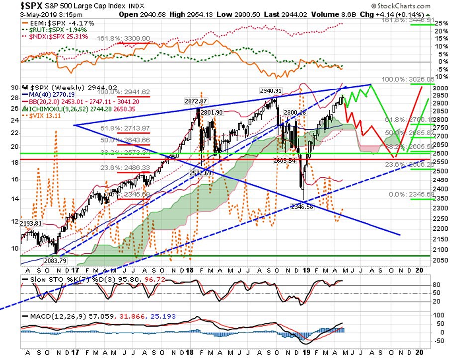
Chart of S&P500 in weekly candles with Ichimoku cloud and VIX represented in orange dotted line behind the S&P500 candles. On the upper panel is displayed the declining Relative Strength (RS) of Small caps Russell2000 versus SP500 in green dash line, the pausing slightly declining RS of Emerging markets versus S&P500 in orange solid line and the strongly rising RS of Nasdaq 100 versus S&P500 in red dotted line. On lower panel MACD is rising steadily above zero confirming a bull rise, while the weekly STO is trying to cross down in strongly overbought area (97%). In case of weekly reversal in first weeks of May, it may display a bearish divergence, which may start the correction deciding over the fate of both red & green paths. Thereafter recall that along the expected Four year cycle the third presidential year (2019) has a bull bias! Source of data: Stockcharts.com. Red & Green RED Paths are proposed by BEST.

Bruno Estier – SAMT Honorary Member – Former SAMT President 1995-2008. – bruno.estier@bluewin.ch
Disclaimer: the above article is for general information and educational purposes only. It is not intended to be investment advice. Seek a duly licensed professional for investment advice.