

Spread BTP-BUND: is this time different?

The generic term spread in economics indicates the difference between two values and may have different meanings depending on the context in which it is inserted. In Italy, it denotes the difference between the yield on Italian 10-year government bonds, the BTP, and the German ones, known as the Bund.
The yield of a state is essentially perceived as the measure of its stability, a low yield identifies a country that can easily repay its debts, while a high yield is equivalent to a situation of uncertainty and, therefore, investors require incentives for the risk they take.
Therefore, a comparison between the virtuous Germany and the indebted Italy, seems more than obvious.
To have more specific confirmations and more details on the trends that are developing, I’ve just suggested in the past that it would be better to add other indicators.
A more precise technical frame could be reached adding another spread that could confirm the presence of potential new instability perceived on the Italian public debt. In this case we can use the spread between the 10-year yield and the two-year yield of BTP. This second spread is much more precise and generally indicates likely stages of recession or pre-default (when short rates become higher than long rates).
Let’s see all these indicators in a chart, starting from the last Italian crisis of 2011/2012. In the graph below, in the first frame we have the spread between BTP and BUND (Box 1), in the second (Box 2), we have the 10y BTP Yield (blue line), and the 2y BTP Yield (red line): I preferred to show the curves of the two rates and not their spread, to avoid evidencing false signals given by simultaneous ascents or descents of the two above mentioned yields.
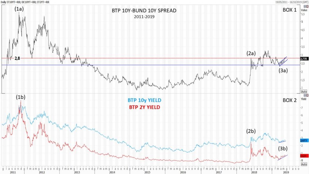
As you can see in box 1, an historical level that starts to indicate the presence of a potential crisis, is the one above 280, appeared for the first time in the graph in 2011 (1a). Looking at the box 2, we can have a confirmation of the event when the 2y BTP Yield line reaches the 10y BTP Yield line (1b); we can read the same pattern in 2018 (2a and 2b).
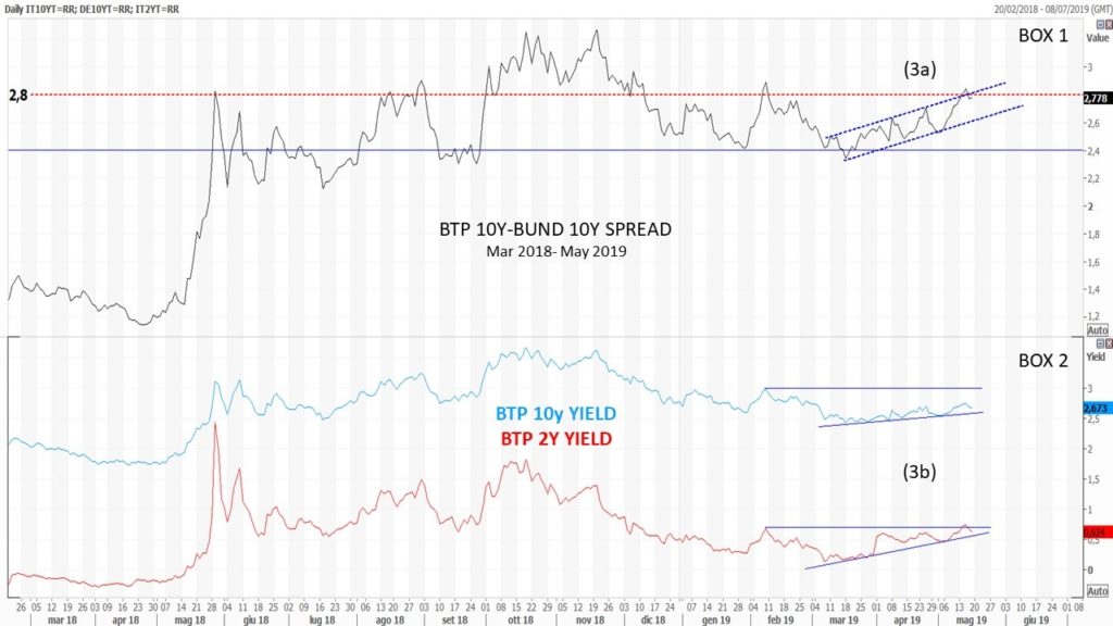
Zooming to the graph, we can note that since the half of March 2019, the volatility of the pattern has completely changed, although the curves are rising, and therefore indicating a worsening of the situation. While in 2012 and 2018 all indicators moved upwards very quickly and with high volatility (Spikes), this time for the Spread the movement is slower but progressive and contained in a bullish channel (3a). The same slow movement appears on the 2-year curve, that is rising with a greater positive inclination than the ten-year one, but also here with a continuous progression (3b).
If the behaviour of the curves will continue in the same way, unlike the past situations of 2011 and 2018, this time we may have a slow deterioration, not instantaneous and very volatile, but however progressive.

Mario Valentino GUFFANTI CFTe – SAMT Vice President – Swiss Italian Chapter – mario.guffanti@samt-org.ch
Disclaimer: the above article is for general information and educational purposes only. It is not intended to be investment advice. Seek a duly licensed professional for investment advice.